How to turn any image into beautiful ASCII art
I’m building a music player that feels like it belongs in the ’80s. Pull-down menus, Norton Commander panels, the whole thing. It’s the same retro spirit behind Noted, the little ’80s-style notes app I made earlier this year.
It needed album covers. A music player feels empty without them, and I wanted the artwork to feel at home in the interface. So the covers are drawn entirely with text.
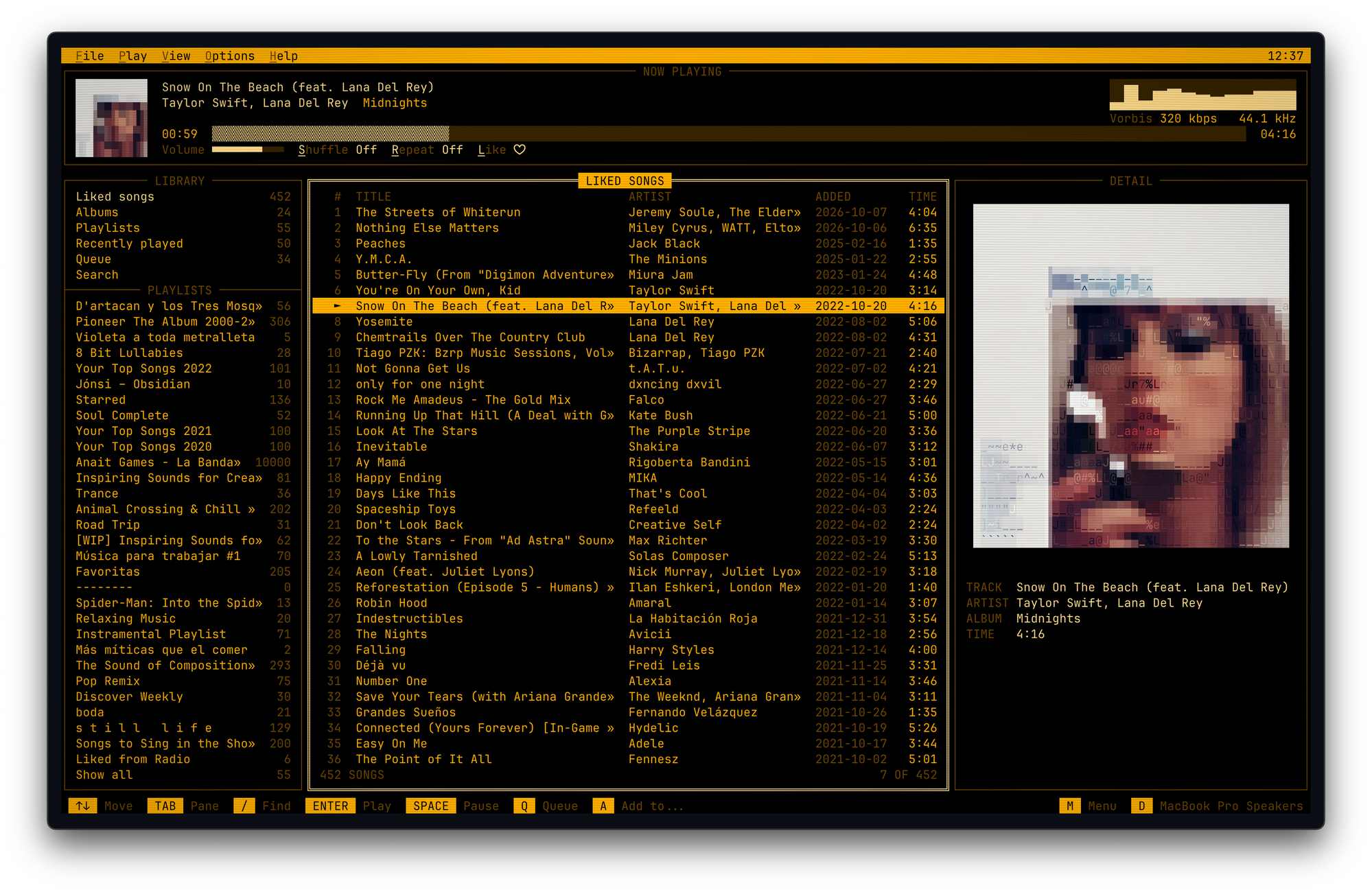
The familiar approach is to replace bright and dark areas with characters like ., +, and @. But brightness only tells you so much. A diagonal line and a horizontal line can have the same average brightness and need completely different characters.
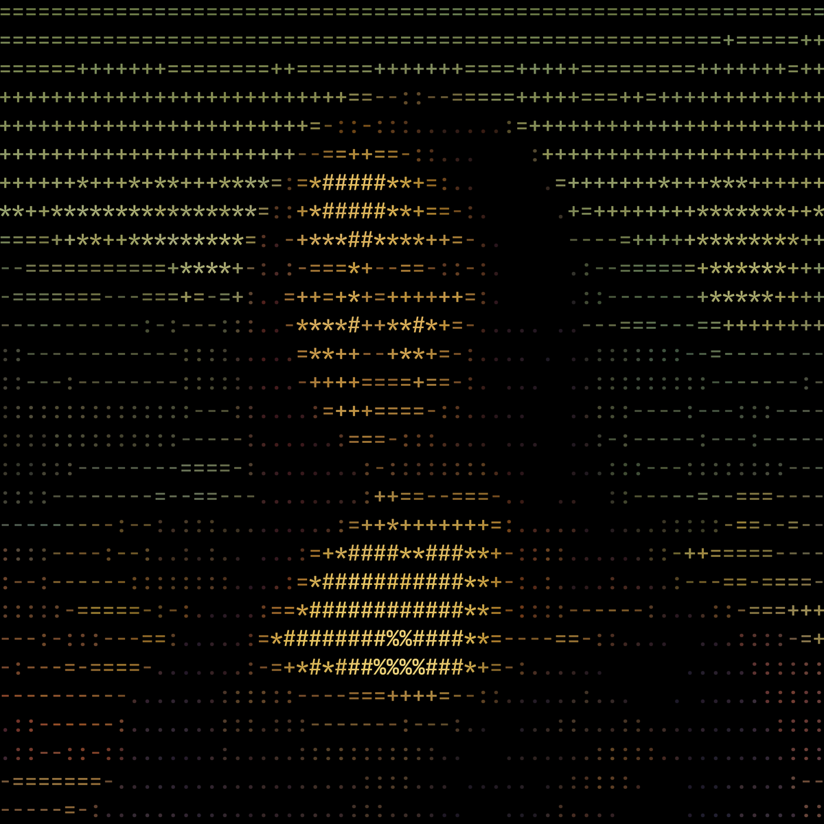 Brightness only
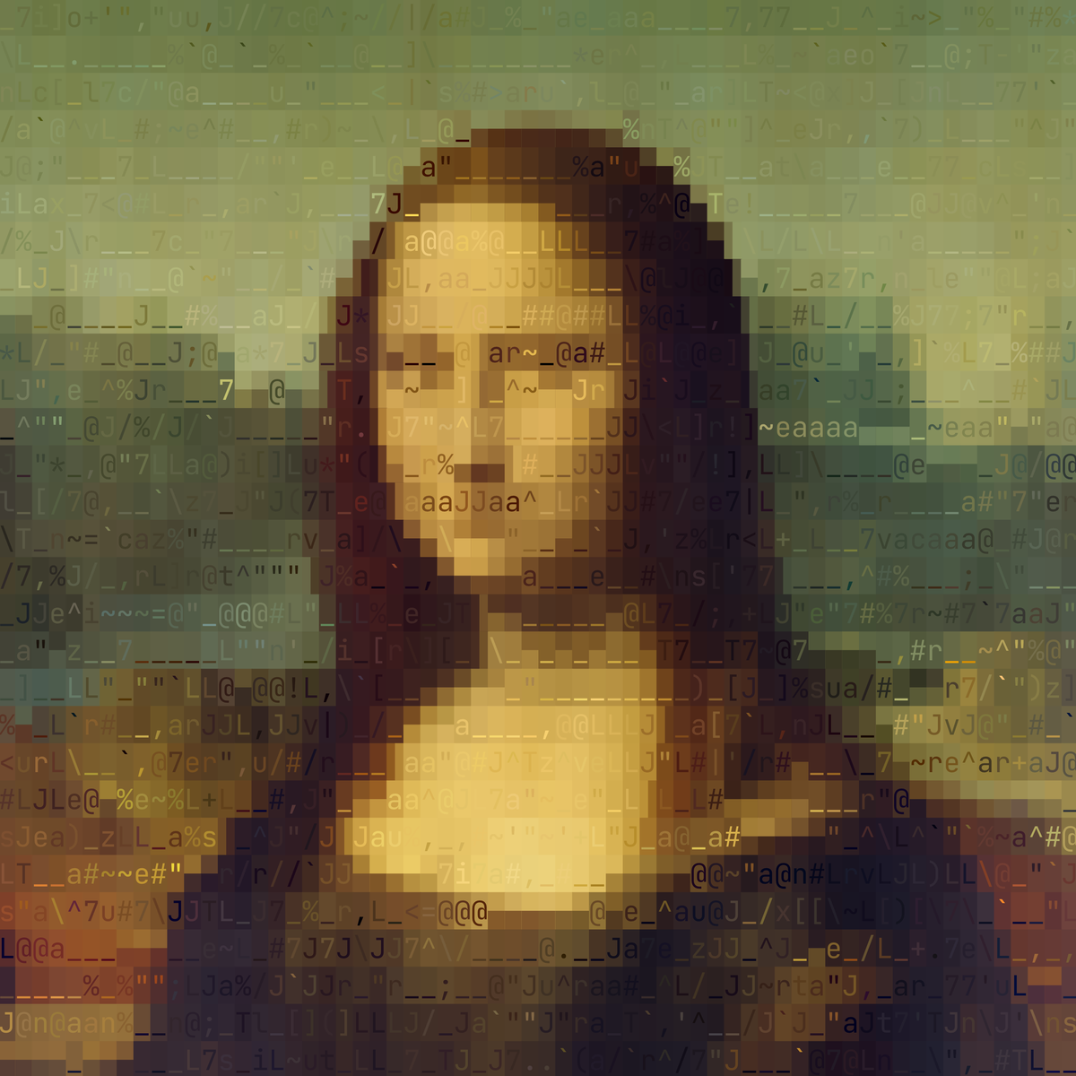 Shape and two colors
That’s the idea behind this renderer: treat each character as a tiny shape, with a foreground and background color, and find a combination that matches that part of the image. Then comes the interesting part: deciding how closely to follow the picture, and how much of the text to keep visible.
Try your own image below. I’ll walk through what the settings change and how to build something similar, or skip straight to the code.
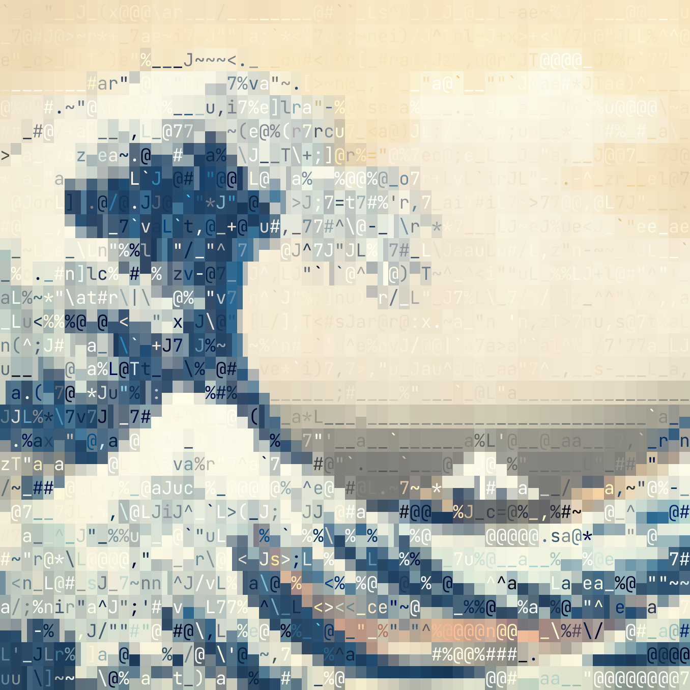
Start with a face or an album cover you know well. Keep that image selected as you change the settings. It’s easier to understand what’s happening when you know what you’re looking for.
A small naming note: this also uses half-block characters beyond the strict ASCII character set. “ASCII art” is the familiar shorthand; “text art” is more accurate.
Treat characters as shapes
The usual brightness-based approach sorts characters from light to dark and picks one for each part of the picture. It works well enough to get something recognizable. But a cell containing a diagonal edge can end up with the same character as a cell containing a horizontal edge. The problem is that it only asks how much light a cell has, never where that light is.
A terminal cell gives us three things to work with: a character, its foreground color, and its background color. The shape of the character determines where those colors appear. A . puts its ink near the bottom. A ^ near the top. A / follows a diagonal. A | runs down the middle.
I picked 46 characters for those shapes: strokes, dots, denser symbols like # and @, and a blank. A script renders each one onto a 9 × 20 grid and records how much ink covers each spot.
./|@Those measurements depend on the font. A / in one font won’t necessarily cover the same pixels as a / in another, so the font used for measuring should match the one used for rendering as closely as possible.
For each piece of the image, the renderer then tries every character:
What foreground and background colors would make this shape look closest to the picture here?
The starting point is a least-squares fit—the same idea used to fit a straight line through a set of points. It gives each candidate a pair of shades and an error score. Lower error means a closer match.
That lets a diagonal edge favor a /, or a small bright detail favor a .. The foreground can also be darker than the background, so the same shape works in either direction.
There’s one more step that makes a big difference: blur both the image and the measured characters a little before comparing them.
Without that, the renderer can spend too much effort matching grain and tiny details that won’t survive at this size. A little blur helps it focus on the larger shapes. Too much blur removes the details we wanted to keep. That’s what Squint controls in the playground. Move it slowly and watch the same part of the image.
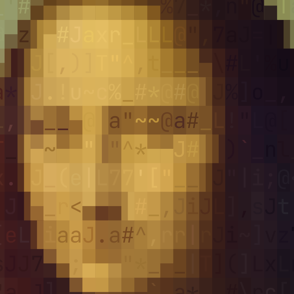 Squint 0
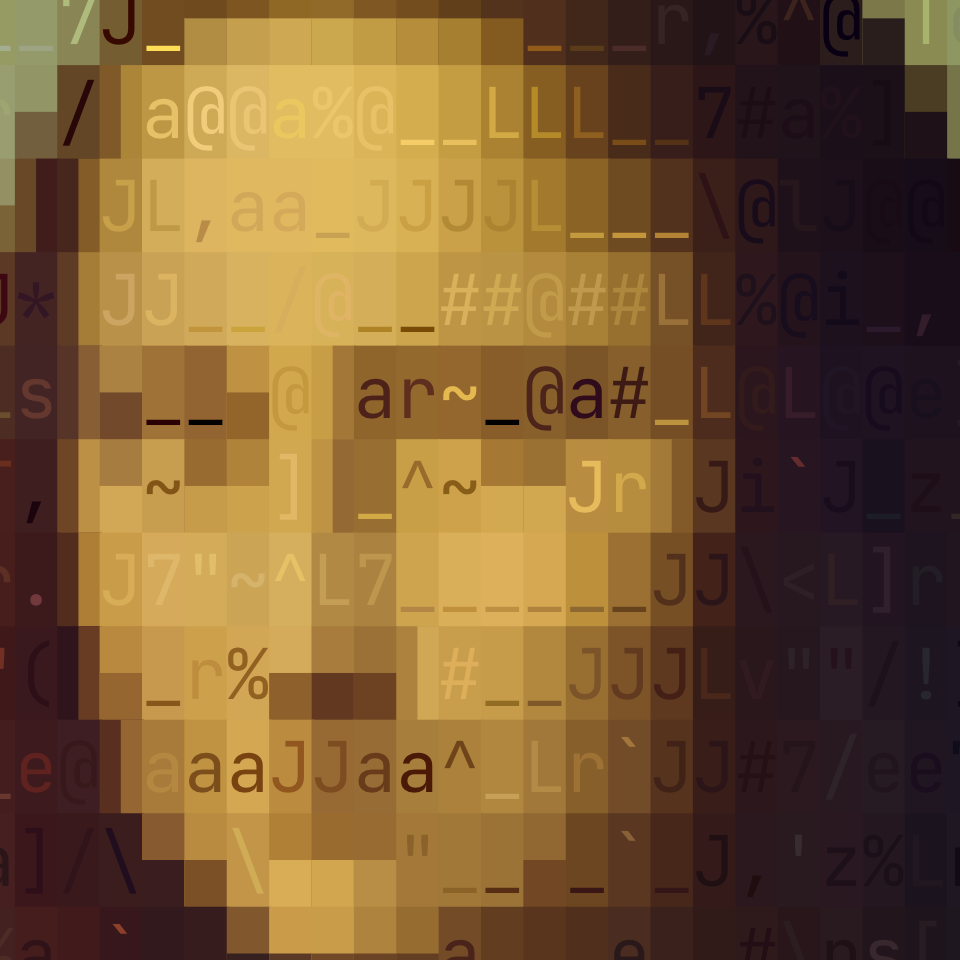 Squint 1 (default)
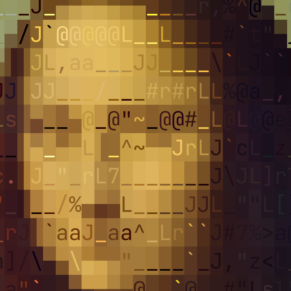 Squint 2
Decide how much text you want to see
Strokes are useful, but they struggle with some boundaries. Think of a face meeting dark hair: sometimes a cell needs a large light region beside a large dark region. That’s where the half blocks ▄ and ▐ come in.
They fill the bottom or right half of a cell. Swap the foreground and background colors, and they can represent the opposite arrangements too.
These shapes help preserve edges that ordinary characters struggle to draw. But they also change the feel of the result. Let them dominate, and the picture becomes more like chunky pixel art.
I wanted the covers to remain recognizable while keeping enough visible text to belong in the player. So half blocks pay a small penalty when the renderer compares candidates. They need to improve the match enough to justify using them.
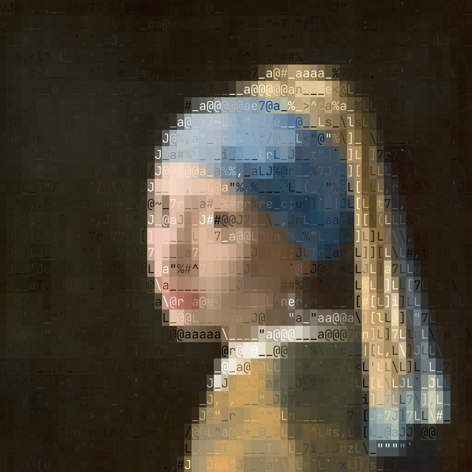 Strokes only
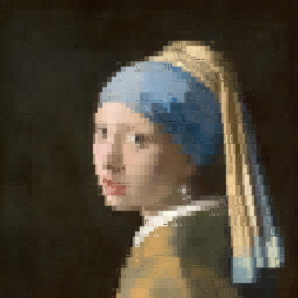 Strokes and half blocks
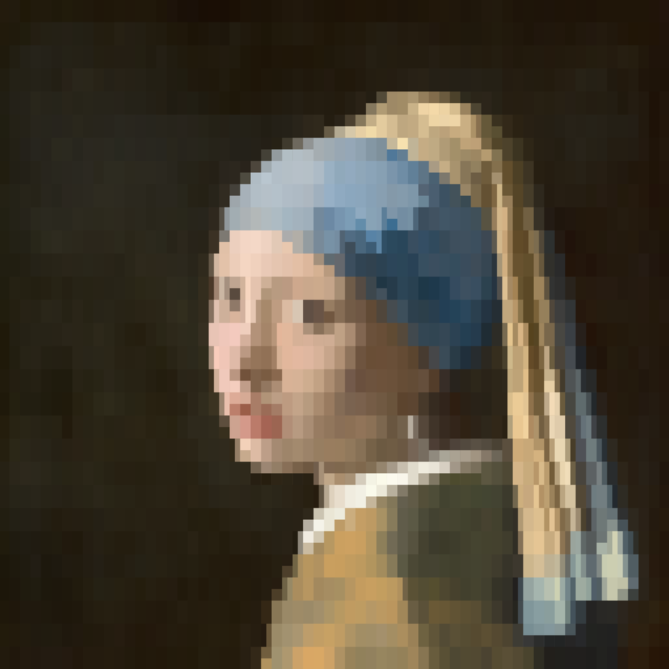 Half blocks only
This is my favorite detail in the whole thing. The error score measures how closely a candidate matches the image. The penalty gives me a way to express a preference about how the result should look.
Try it yourself:
- Switch Characters to strokes only and look at the outline of a face.
- Switch back to strokes and half blocks.
- Lower Half-block cost and watch where solid shapes start replacing the strokes.
Neither end of that slider is automatically better. It depends on the image and the look you want.
Size changes the tradeoff too. In my player, covers under eight rows use only half blocks and blank cells, with no penalty. At that scale, individual strokes can become distracting, and the larger color regions do more of the work. Drag Fidelity down to see where that happens for your image.
Bring back the contrast and color
There are two other details that affect how well a cover reads.
First, contrast. Before fitting the characters, the renderer stretches the image’s brightness range, clipping the darkest and brightest 2% of samples. That keeps a few extreme pixels from determining the contrast of the whole picture. It only changes the brightness used to pick characters and to color the themes; with original color, each cell still keeps the cover’s own colors.
It can help a washed-out cover survive at a small size. It can also change the mood of a deliberately soft image, which is why it’s useful to compare both versions. Toggle Stretch contrast while keeping everything else the same.
Then there’s color. The character is chosen using brightness. Once that shape is selected, the renderer fits foreground and background values separately for red, green, and blue. That produces two colors suited to the chosen character.
This keeps the cover’s colors while giving the shapes a consistent basis for comparison. It also means the character selection is driven by brightness, so boundaries that differ mainly in hue can be harder to preserve.
For themes such as Amber, Green phosphor, Charcoal, and Commodore 64, those brightness values map onto the theme’s palette instead. Try changing Theme after you’ve found settings you like. You can see how much of the image remains recognizable when its original colors disappear.
Build your own
The core loop is small enough to explain in pseudocode. You need a way to read image pixels, rasterize characters, and draw colored text cells.
First, measure the characters once. Render each one white on black in the chosen font, normalize the pixel values between 0 and 1, and apply the blur:
const glyphs = characters.map(character => ({
  character,
  ink: blur(
    rasterize(character, font, cellWidth, cellHeight)
  ),
}));
Here, 0 means no ink and 1 means full ink. Values between them describe partial coverage.
Resize the image so each output cell has a matching patch of samples. Account for the cell’s proportions: terminal cells are usually taller than they are wide, so treating them as square will stretch the picture.
For a given character, each sample is approximated by:
background + (foreground - background) × ink
That’s a straight-line relationship between ink coverage and brightness. Here’s a simplified fit. The helper functions operate on arrays of normalized samples:
function fitShades(samples, ink) {
  const inkVariance = variance(ink);

  const slope = inkVariance > 1e-8
    ? covariance(ink, samples) / inkVariance
    : 0;

  const intercept = mean(samples) - slope * mean(ink);

  const background = clamp01(intercept);
  const foreground = clamp01(intercept + slope);

  const error = mean(samples.map((value, i) => {
    const drawn =
      background + (foreground - background) * ink[i];

    return (drawn - value) ** 2;
  }));

  return { foreground, background, error };
}
This computes an unconstrained least-squares fit, then clamps the colors to the valid range. That’s a compact approximation when the fitted values fall outside that range. A bounded least-squares solver handles those limits more precisely; refitting the other color after each clamp, as the playground does, gets close.
Finally, try the candidates and keep the one with the lowest score:
const picture = prepareImage(cover, {
  columns,
  rows,
  cellWidth,
  cellHeight,
  stretchContrast,
  blurAmount,
});

for (const cell of cells(picture)) {
  let best = null;

  for (const glyph of glyphs) {
    const fit = fitShades(cell.brightness, glyph.ink);

    const score = fit.error +
      (isHalfBlock(glyph.character) ? halfBlockPenalty : 0);

    if (!best || score < best.score) {
      best = { glyph, fit, score };
    }
  }

  drawCell(cell.position, best);
}
For original color, run fitShades again on the red, green, and blue samples using the winning glyph. For a theme, map the fitted brightness values onto its palette.
The useful part to experiment with is the scoring. Start with the image difference, then see what happens when you change the character set, blur amount, or half-block penalty.
My player also splits the work across processor cores and evaluates candidates in batches. Those optimizations help with speed, but you can explore the visual approach with a straightforward loop first.
What I learned
The half-block penalty is a small detail, but it captures the main challenge. I wanted recognizable covers, with enough visible text to feel at home in the player. Measuring the characters gave me a way to compare candidates. Adjusting the scoring gave me control over the look.
The playground helped me see those decisions. Change one setting, keep the image the same, and the tradeoff becomes obvious.
If you’re trying this yourself, start with one image you know well. Get that working, then try something very different: a face, small lettering, a dark photograph, a flat illustration. Each will show you something the first image didn’t.
And if you find a cover that turns into complete mush, send it my way. I want to see what breaks it.