Worklog: Running Race Calculator
I’m pairing with Lucia to build a pet project that would let people estimate the race pace and total time when running races. It’s the perfect excuse to do two things:
- She’d code all the project to keep improving her front-end skills
- I’d stretch the creativity muscle and create a small UI kit to facilitate side projects
I’ve been pondering about the idea of having a daily worklog, let’s give it a try! If you got comments or suggestions please do share them.
August 26, 2018 at 19:14
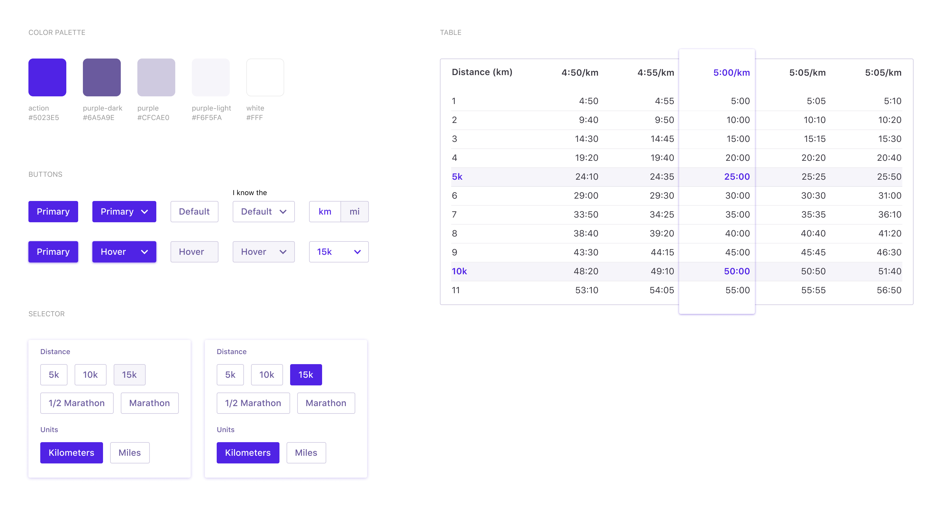
I’ve covered the basic input controls and the results table. Speaking of which, we’ve decided that the table would feature not only one pace time column but a few more, showing pace time if you run a few seconds faster and slower. The idea is helping people to guess their time without fine tune seconds up and down by having a broader range.
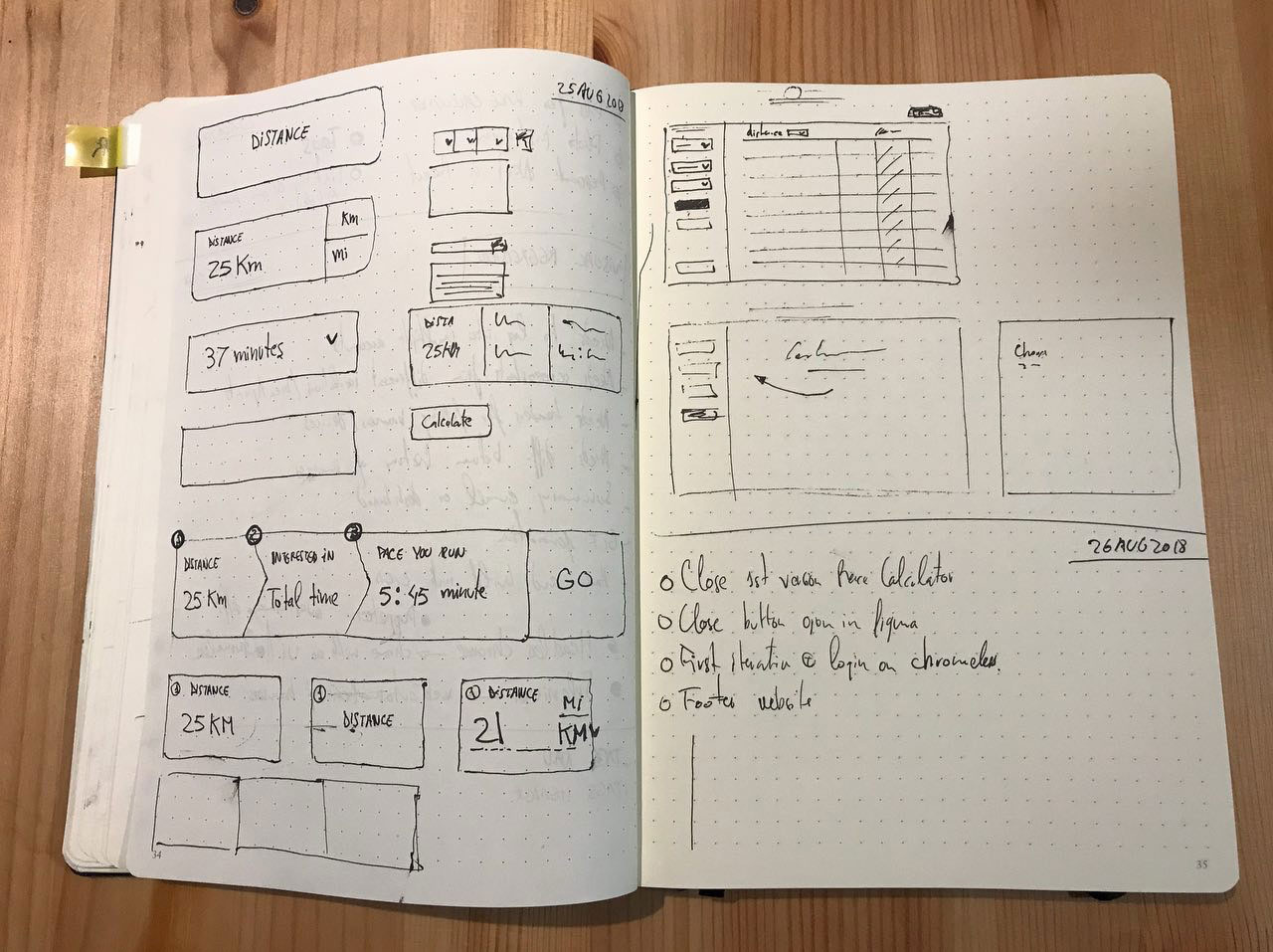
For the first version we’re going to keep things pretty simple, so I was sketching basic empty cases where the layout would always remain the same with the controls on the left and the results table on the right. The table would become an empty case pointing out to the controls until the user starts generating results.
On the development side, Lucia has started to put together the React application. The functionality was already there so now she’s investing some time translating all the vanilla JavaScript functionality into React components.
August 25, 2018 at 20:03
We’ve been discussing a little bit how to surface the information to the user. The equation is pretty straightforward: you always have distance, and then the user needs to set either a total time or a pace time, and we’d generate the results.
Initially, I was tempted to force the user to choose between two tabs/switch, but it felt wrong, so we’re going to keep things simple and present the info in three steps:
- What’s the distance you’re running?
- Do you want to calculate your pace or total time?
- Set a time and hit ‘Calculate.’
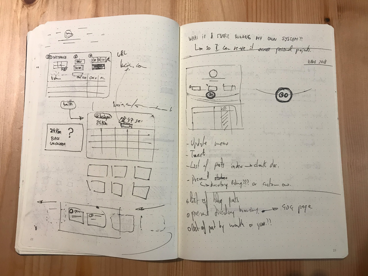
All these doubts appeared after reviewing how other online calculators present all the options at first level, so they’d automatically calculate the option you leave empty: distance, total time or pace time. I found that a bit confusing.
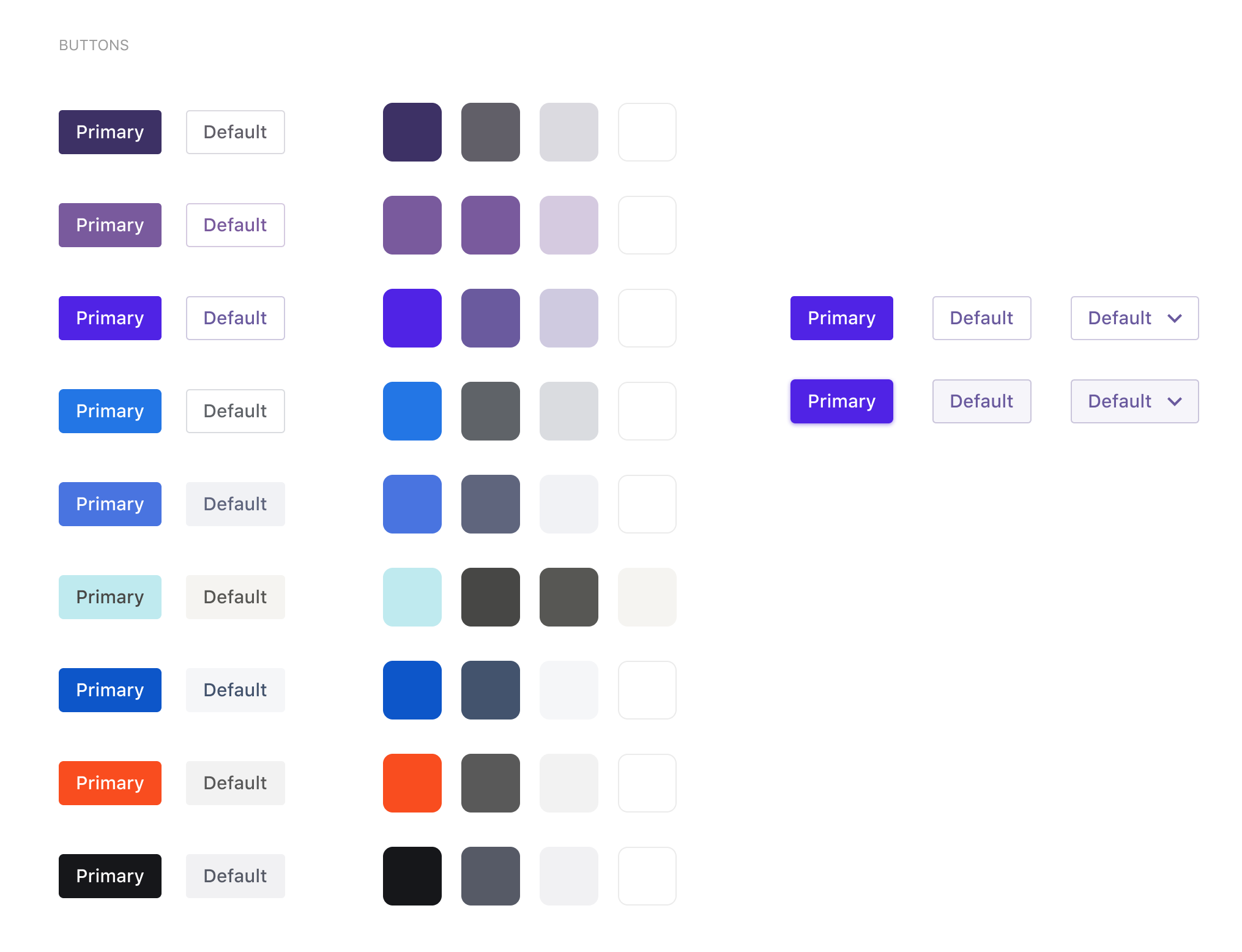
I’m also starting to explore how the interactions are going to behave and look. Lucia wants to have something strong for the primary actions, something purplish. I’ve been using blue as the primary action so many years in different companies (now, at Microsoft) that I guess it’s a blow of fresh air my eyes 😅.
August 11, 2018 at 16:05
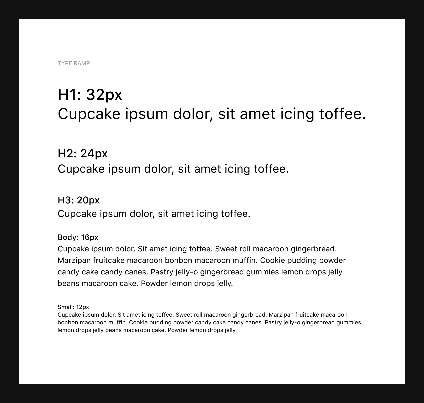
When thinking about the visual execution of new projects I always start with the basic unit of information which is the text and its type ramp. I’m also going back to native fonts since they run fast as hell though I may take the license to use Montserrat for big bold titles when representing the time and other cool data about your running stats.
I’d keep you posted!
August 10, 2018 at 22:30
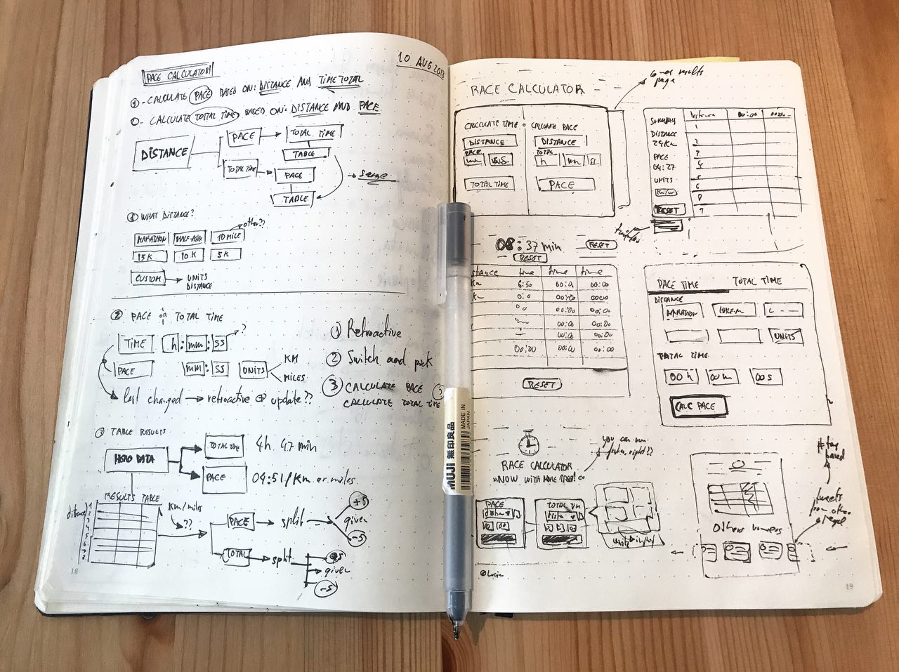
I’m trying to map the basic elements that would be needed in order to have the race calculator. I don’t feel 100% convinced of what should be the right approach: asking the user what they need to know (pace VS total time) or just give all the option and let them figure out. At this point, I’m towards defaulting to set a pace that would generate the total time and they would be able to switch from a pivot to the other option.
I’m sharing some rough sketches of the process from my notebook:
